Designing rules, not just components
A Design System for Delta
 Role | Senior UX/UI Designer
Tasks | Research, design system strategy, accessibility, stakeholder alignment and mentoring.
Background
Context
Delta, a procurement platform, was transitioning from a legacy product to a modern experience. However, it lacked a design system, resulting in inconsistent components, colours and design patterns across the platform.
I led the creation of a shared design system, establishing its foundations, introducing WCAG 2.1 AA accessibility standards and aligning designers and developers.
Problem
Delta’s clients could personalise their portals with their own logos and brand colours. The challenge was to accommodate clients without compromising consistency, scalability or accessibility.
How might we create a design system that allows client-specific customisation while ensuring a consistent and accessible experience across all portals?
Process
Discovery
As a starting point, I audited the existing platform to identify its components, patterns and inconsistencies, helping define the scope and requirements of the new design system.
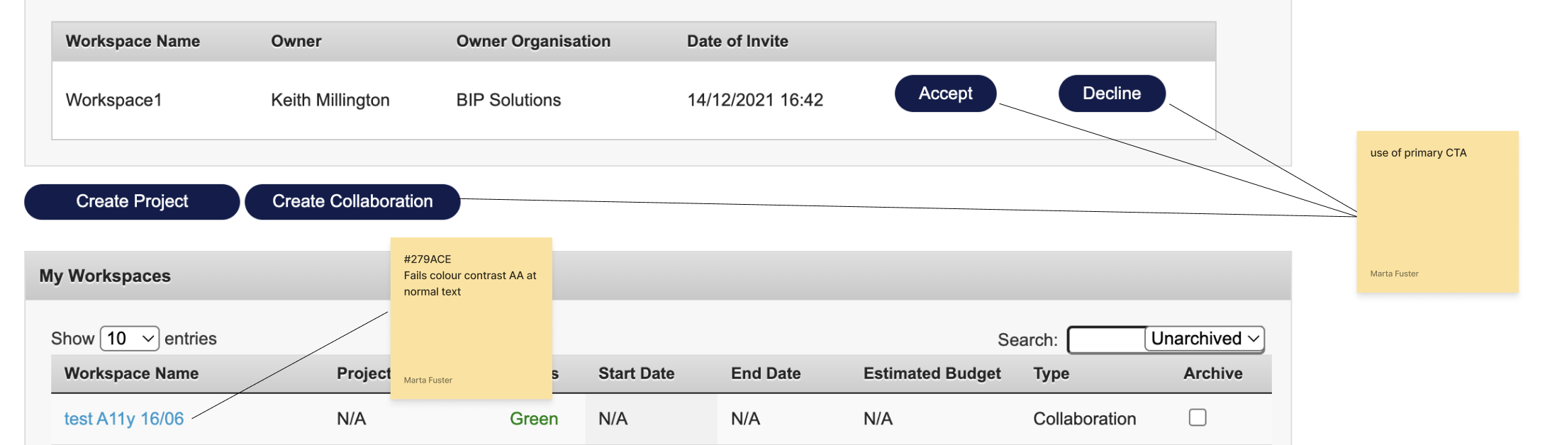 Delta discovery.
Foundations
As Delta’s users were primarily interacting with government contracts, we used the GOV.UK design system as our starting point, adapting its established patterns and accessibility principles to our platform.
We also introduced shared naming conventions to establish a common language between designers and developers.
Collaboration
Before I joined Delta, design decisions were largely developer-led, with no established UX practice. This meant introducing a design system also required changing how teams worked together.
I organised workshops with developers and the design team, involving developers in creating components rather than simply handing over finished designs.
This established shared ownership, aligned design and development decisions, and improved consistency across the platform.
Customisation
A key decision was defining what could change. Customisation was limited to logos and colours, while typography, spacing and corner radii remained fixed to ensure consistency across all portals.
Colour
The palette included primary, secondary, highlight and neutral colours, alongside success and error states. All colour combinations were tested against WCAG AA contrast requirements.
Primary, secondary and highlight colours were defined as design tokens, allowing each portal to reflect its brand.
To accommodate different brand palettes while maintaining accessible feedback states, I introduced warm and cool variations of success and error colours. Neutral colours remained fixed to preserve readability and consistency.
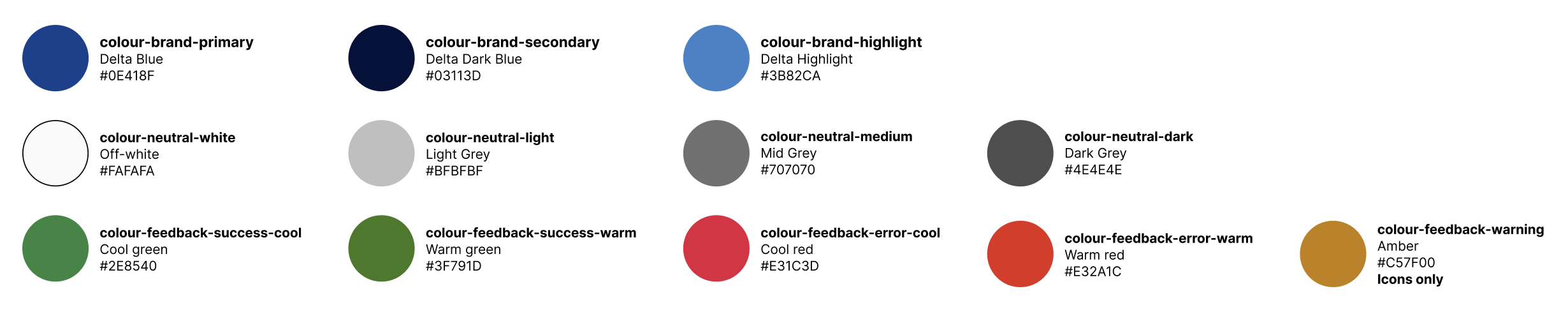 Design system colour palette.
Typography
Typography remained fixed across all portals, ensuring a consistent hierarchy and readable experience. Brand colours could be applied to headings and links, allowing each portal to retain its visual identity.
Components
We designed and documented over 30 reusable components covering input controls, information display and navigation, supported by a shared icon set.
Each component included its states, spacing, usage guidelines and supporting research, drawing on sources such as GOV.UK and Nielsen Norman Group.
Accessibility was considered at component level, including keyboard focus states, colour contrast and visual feedback.
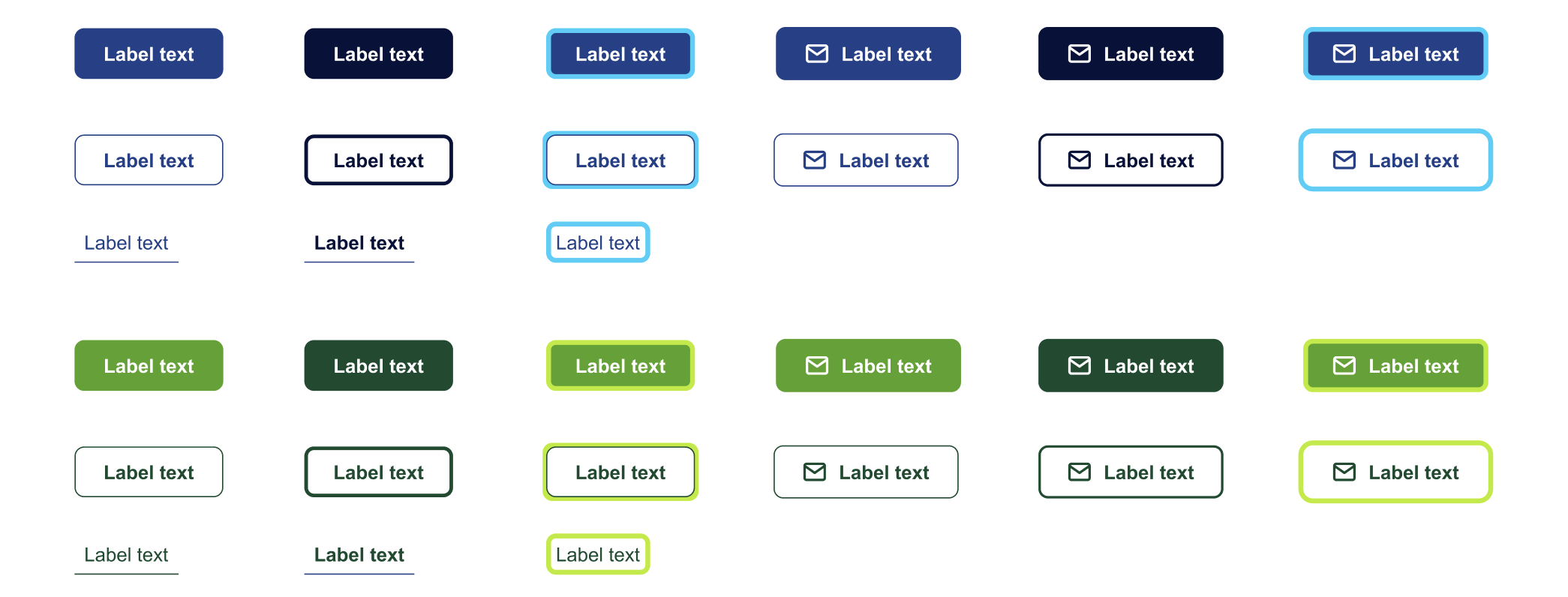 Call to action for Delta and a branded portal.
Brand audit
With 63 branded portals to support, we audited each one to identify its existing logos and brand colours.
We tested primary and secondary colours against WCAG AA contrast requirements. Where colours failed, we explored alternative colours within each client's brand palette that met the accessibility requirements.
Approved colours were integrated into the design system as design tokens, creating a scalable approach to multi-brand customisation.
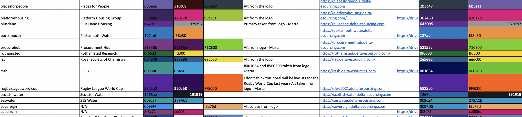 Branded portals audit.
Application
Developers implemented the design tokens across all 63 branded portals. We then reviewed the themed interfaces to validate colour combinations, consistency and accessibility in real product screens.
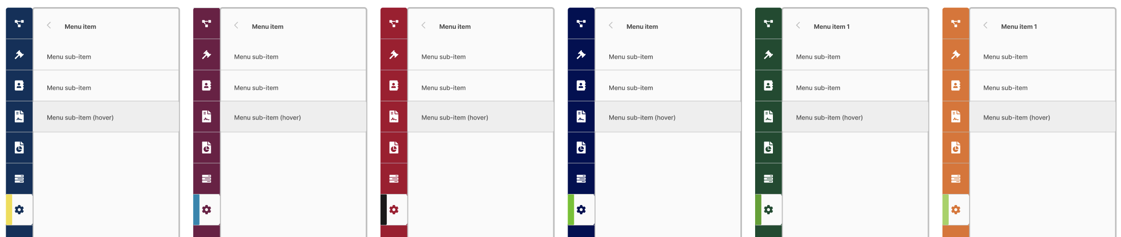 Branded portals customised using design tokens.
Results
Outcomes
- A scalable design system: Delivered over 30 documented, reusable components aligned with WCAG 2.1 AA requirements.
- Improved design and development efficiency: Shared components and design tokens reduced duplicated work, giving designers and developers a common foundation to build from.
- 63 branded portals: Enabled client-specific customisation through design tokens, maintaining consistency across all portals.
- Faster portal branding: Client colours could be configured through design tokens, making it quicker to apply branding across portals without redesigning individual components.
- Greater consistency: Shared components, fixed foundations and common design rules created a more consistent experience across all 63 branded portals, while still allowing each client to retain its visual identity.
- Successful adoption: Supported the wider platform transformation, with the new experience positively received by users at launch.
Takeaways
- Define the rules before designing the components. Establishing what could and couldn’t change was essential to maintaining consistency across 63 portals.
- Make developers co-creators, not just implementers. Involving developers in the creation of components built shared ownership and helped bridge the gap between design intent and implementation. Their input also helped shape a scalable system that worked beyond the design files.
- Design for flexibility from the start. Anticipating future branding requirements avoided having to retrofit customisation into the system later.